
TALFLO
Redesigning a storefront to beat a conglomerate
A two-person manufacturer went head-to-head with Ingersoll Rand and took ground online — by out-designing the giant, not outspending it.
- increase in online revenue
- 90%
- increase in average order value
- 10%
- Client
- TALFLO
- Role
- Positioning, UX/UI & Front-End
- Year
- 2024
- Timeline
- ~6 weeks
At a glance
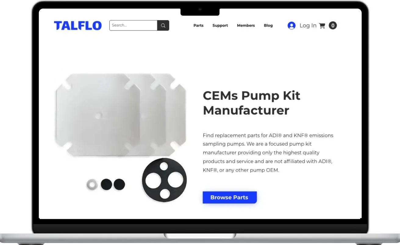
TALFLO machines replacement parts for emissions-sampling pumps. It is about as unglamorous a category as B2B gets, and the company was losing sales it had already earned: the site's only obvious call to action pushed buyers into a manual, phone-based quote that cost more to serve and returned less per order. I rebuilt the purchase path around a single question — can a plant engineer find the right part and buy it without calling anyone? — and shipped it inside the platform the team already knew.
- Challenge
- The one clear call to action on the site funnelled buyers into a manual phone process that actively reduced revenue per order.
- Approach
- Audit the funnel screen by screen, cap every view at two decisions, and rebuild the path in the existing stack so nothing had to be relearned.
- Outcome
- Online revenue rose 90% and order value 10% — enough confidence for TALFLO to raise prices and still grow through 2024.
What I owned
Everything on this list, end to end — no agency, no hand-off.
- Competitive positioning against a national conglomerate
- Funnel audit and information architecture
- Wireframes, prototype and full UI design
- All on-page and product copy
- Product photography and image standards
- Front-end implementation in the existing Wix stack
- Technical SEO — metadata, image optimisation, layout
Brief
There was no brief.
When I dropped TALFLO’s new logo onto their existing site at the end of our branding project, the visual clash exposed something bigger. The purchase process and the navigation were quietly costing the company sales.
Gerald Cormier, the CEO, was trying to grow a manufacturing business that ran on manual work — processing orders by hand, machining pump parts, shipping nationally, all against a far larger competitor. He wanted to build something he could hand to his two kids. Momentum had stalled.
So I proposed the redesign myself, with one goal: increase online conversions without adding manual order processing. That constraint mattered more than it sounds. Every additional phone order was a cost, not a win.

Discovery
Analysing the site surfaced several points of friction, most of them textbook.
- Nearly every screen asked the visitor to make too many decisions at once. Hick's LawThe more choices you put in front of someone, the longer they take to decide — and the more likely they are to decide nothing at all.Learn more about Hick's Law
- Buyers had to hold too much in their head to get through a purchase: which part they needed, whether it matched their equipment, and whether they were even on the page that would let them buy it. Miller's LawPeople can only keep about seven things in working memory at once. Ask for more and they lose their place.Learn more about Miller's Law
- Visual weight was spread evenly across competing actions, so nothing led. Visual hierarchySize, contrast and position tell the eye what matters first. When everything is emphasised, nothing is.
- Key sections were washed out — the home hero worst of all. ContrastText and interface elements need enough separation from their background to be readable at a glance, not just technically visible.
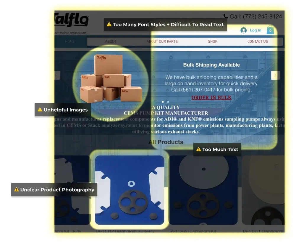
The result was predictable. Complex navigation made the funnel hard to move through. Unclear purchase actions led to abandoned carts. An unpolished design eroded trust with first-time visitors.
The most telling finding was not a usability problem at all — it was a positioning one. The single most obvious call to action on the site was “bulk pricing discounts.” It funnelled customers into a manual, phone-based process that reduced revenue per order. The site’s loudest message was working against the business. Call-to-action costEvery call to action carries a cost to serve. A prominent one that routes to your most expensive, lowest-margin channel is a marketing decision, not just a design one.
Design
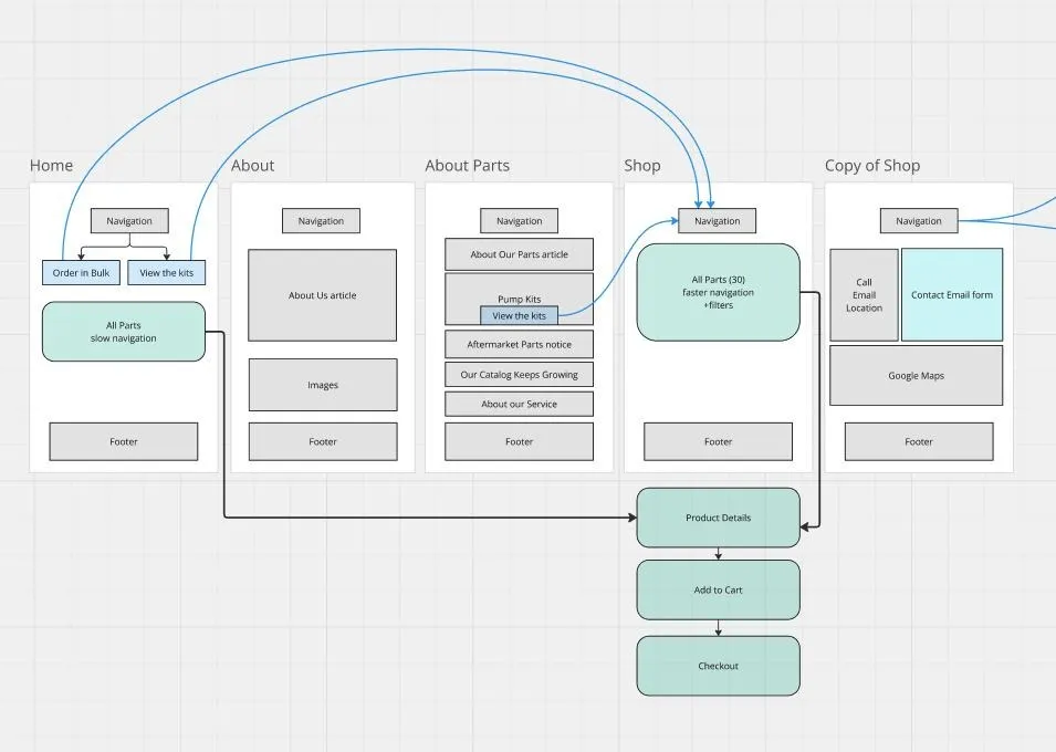
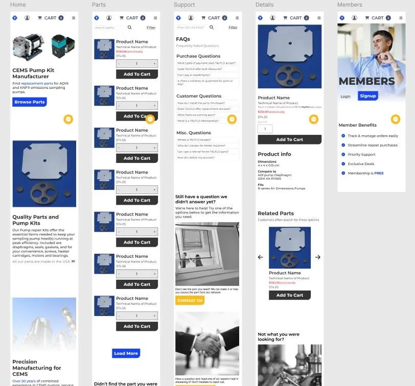
I wireframed the current sitemap in Miro, then corrected the funnel screen by screen.
- I capped each view at two actions, with the preferred one in higher contrast. Hick's LawFewer choices, faster decisions. Two actions with one clearly preferred beats six of equal weight.Learn more about Hick's Law
- Every screen got a single focused goal, so users moved forward carrying only the information that step actually required. Miller's LawReduce what someone has to remember between steps and they stop backtracking to check.Learn more about Miller's Law
- I kept the layout close enough to the original that returning customers were not disoriented — reducing screens and information rather than reinventing the flow. Weber's LawPeople notice change in proportion to what was there before. Small, familiar-feeling changes get adopted; wholesale reinvention gets resisted.Learn more about Weber's Law
- I used size, contrast and position to steer attention from top-left to bottom-right, with action buttons in the primary colour and most of the page kept deliberately neutral. Visual hierarchyAttention follows the loudest element. If you only make one thing loud, you decide where people look.
- I reserved TALFLO’s primary blue for “success” actions and the secondary yellow for support, so forward motion always looked the same. PrimingRepeated colour and shape cues teach people what to expect before they read the label — a consistent 'go' colour speeds up every later decision.
- Product details and FAQs stayed one tap away but out of sight, so purchase actions kept the focus while the information needed to decide was still reachable. Progressive disclosureShow what is needed now; keep the rest one deliberate step away rather than on screen by default.Learn more about Progressive disclosure
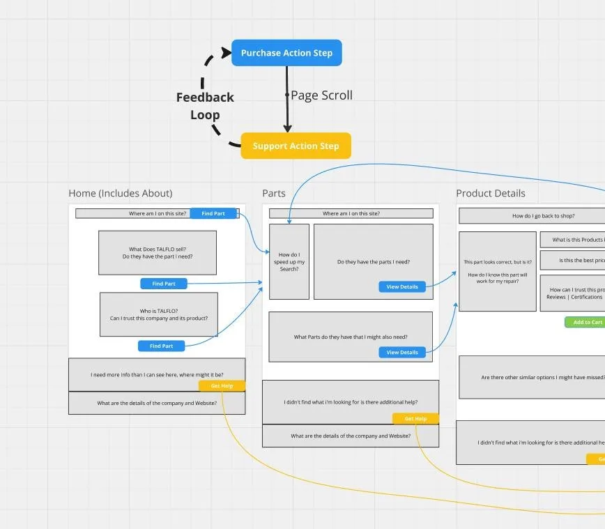
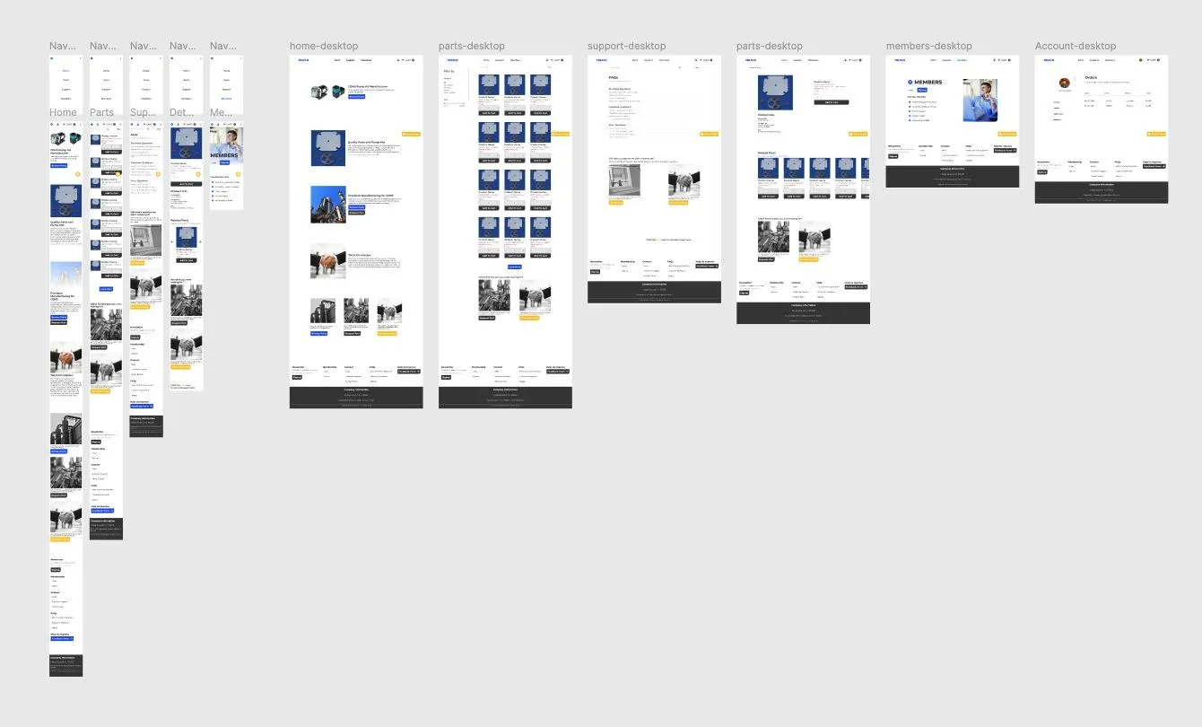
The wireframe and prototype did double duty. They clarified the build, and they showed the TALFLO team how the visual design mapped to smoother operations — which is what got the redesign approved in the first place.
Delivery
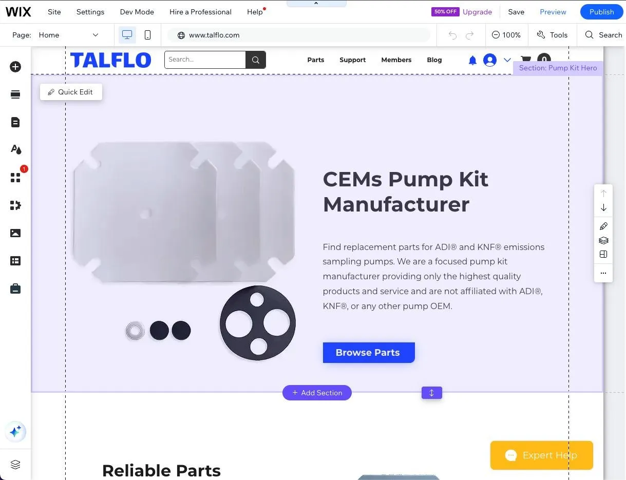
Rather than replatform — which would have forced TALFLO to relearn everything they knew about running their own site — I implemented the new design inside their existing Wix stack, then optimised images, metadata and layouts for search. Weber's LawThe same principle that kept the customer-facing layout familiar applied to the team's own tooling: the cheapest change is the one nobody has to be retrained for.
During the build I photographed the product line myself and produced standardised images aligned to Amazon Seller standards, so the purchase experience felt familiar to American buyers by default. Default biasPeople trust the format they already know. Matching the conventions of the marketplace buyers use daily removes a question they would otherwise have to consciously answer.


Results
Online revenue rose 90%. Total orders rose 18%. Average order value rose 10%, and revenue across the whole company rose 17%.
The number I care about most is the one behind them: the redesign gave TALFLO enough confidence to raise their prices — and they still grew. Through 2024 they retained and expanded their customer base despite the increase, taking ground from a much larger rival on experience rather than spend.
That is the whole argument for this kind of work. TALFLO could not outbid Ingersoll Rand for attention. They could be the obviously easier company to buy from.
Impact
The redesign changed what the business could charge, not just what it converted.
It also changed how the company ran. Every order that completed online was an order that did not need a phone call, a hand-written note and a manual invoice — so the same two people could serve more customers without working more hours. The design constraint I set at the start (“no additional manual processing”) turned out to be the thing that made the growth sustainable rather than exhausting.
The numbers
- increase in online revenue
- 90%
- increase in total orders
- 18%
- increase in order value
- 10%
- increase in company revenueAcross the whole business, not just online.
- 17%
Disciplines and tools on this project
- Conversion
- E-commerce UX
- Positioning
- Technical SEO
- Figma
- Miro
- Wix
- Photoshop
- Google Analytics
- Search Console