
Fiction Build Co.
Designing a Brand Identity for AI enabled Construction Company
Most small trade brands live and die on a phone camera. This one was built so the work in the field looks like the brand without needing an art director.
- cohesive design system
- 1
- art direction needed for most visual work
- 0
- Client
- Fiction Build Co.
- Role
- Brand Identity & Design System
- Year
- 2026
- Timeline
- ~5 weeks
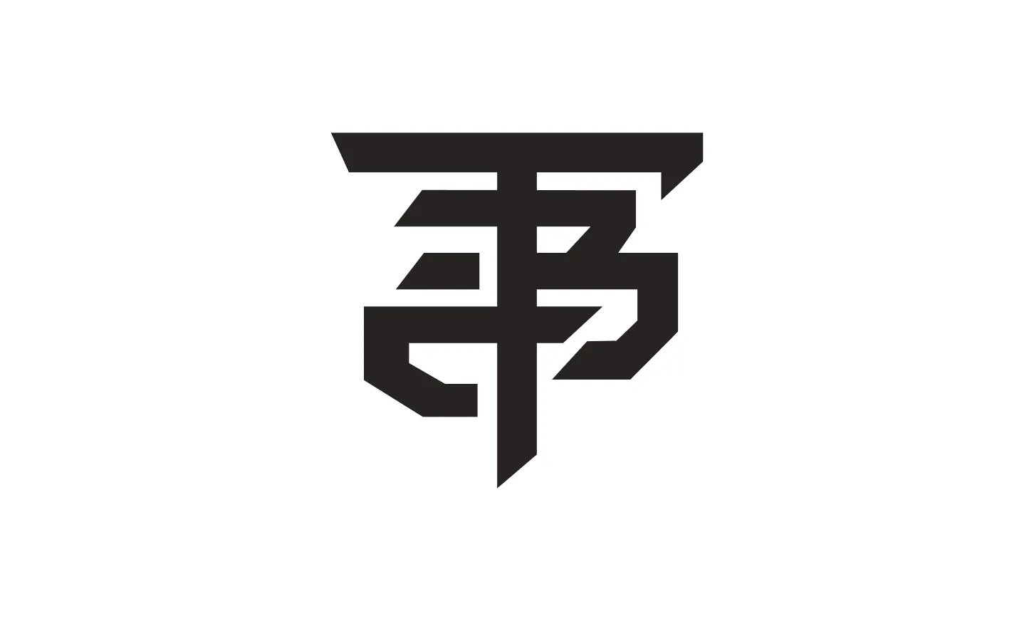
At a glance
Fiction Build Co. is a builder doing high-craft work — tile, poured concrete, stone, timber framing — and documenting almost all of it on a phone, on site, one-handed. They needed more than a Logo to stand out in the competitive high-end construction market. The deliverable was an identity plus a design system and AI could use to guide the leadership team without hiring me full-time as an art director.
- Challenge
- A precision-craft builder whose brand had to be applied daily by people on a job site, not by a design team.
- Approach
- Build a monogram that survives being stamped, embroidered and shot in bad light, then build an AI enabled design system that can generate assets that align with the premium brand.
- Outcome
- One mark with four sanctioned lockups and a documented visual system the crew applies without art direction, just Cluade.
What I owned
Everything on this list, end to end — no agency, no hand-off.
- Logo exploration, refinement and final monogram
- Full lockup set and clear-space rules
- Material and surface application guidance
- Design system documentation in Figma and Transferred to Claude Design
Brief
Fiction Build Co. builds things most contractors decline: mitred stone, poured concrete counters, laser-set tile, timber frames. Complex stuff that makes other contractors cringe and sweat just thinking about it. The craft was never the problem. The problem was that the brand had to keep up with the level of skill in places the builders don’t usually work. Marketing materials, social media campaigns and website assets.
While the builders skill was there, the budget for a full-time designer was not.
Discovery
Looking at how the work was already being documented made the requirements obvious.
- While the owner of the business understood the basics of using AI and design. The results from AI generated logos were not precise or unique enough for his brand.
- During initial interviews it was also clear the brand needed to be revolutionary in it’s look to keep ahead of a competitive luxury construction market near the smokey mountains.
- The audience judges a builder on precision and consistency. Having a brand that changes every time a new image is generated by AI would undermine that perception.
Design
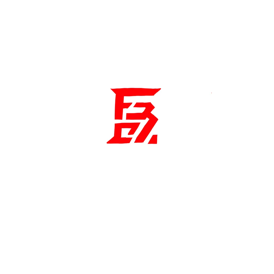
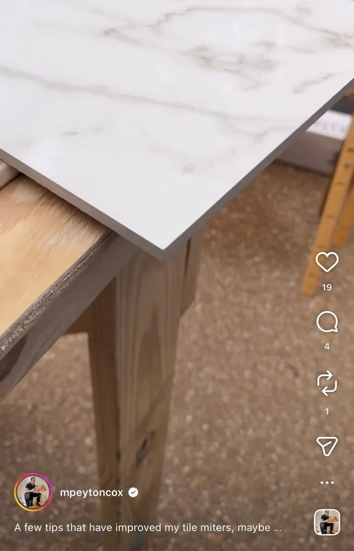
The monogram interlocks an F, B and C into a single shape built from heavy, mitred strokes. The joins are deliberate — they read as framing and as a mitre joint, which is the company’s actual signature move in stone and tile. I iterated through several times before arriving at the final design.
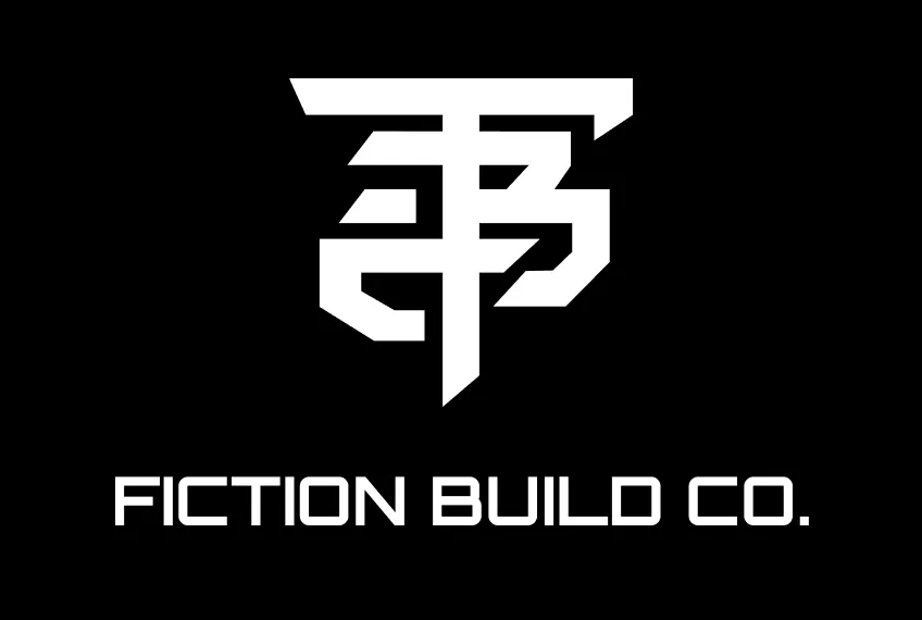
Delivery
The identity shipped as a system, not a logo file. The part that mattered most was the section covering visuals and materials — how to shoot the work, what surfaces the mark is allowed to sit on, and what to do when the shot is too busy to hold it. These guidelines were created in Figma, then handed off to a customized Claude Design system.
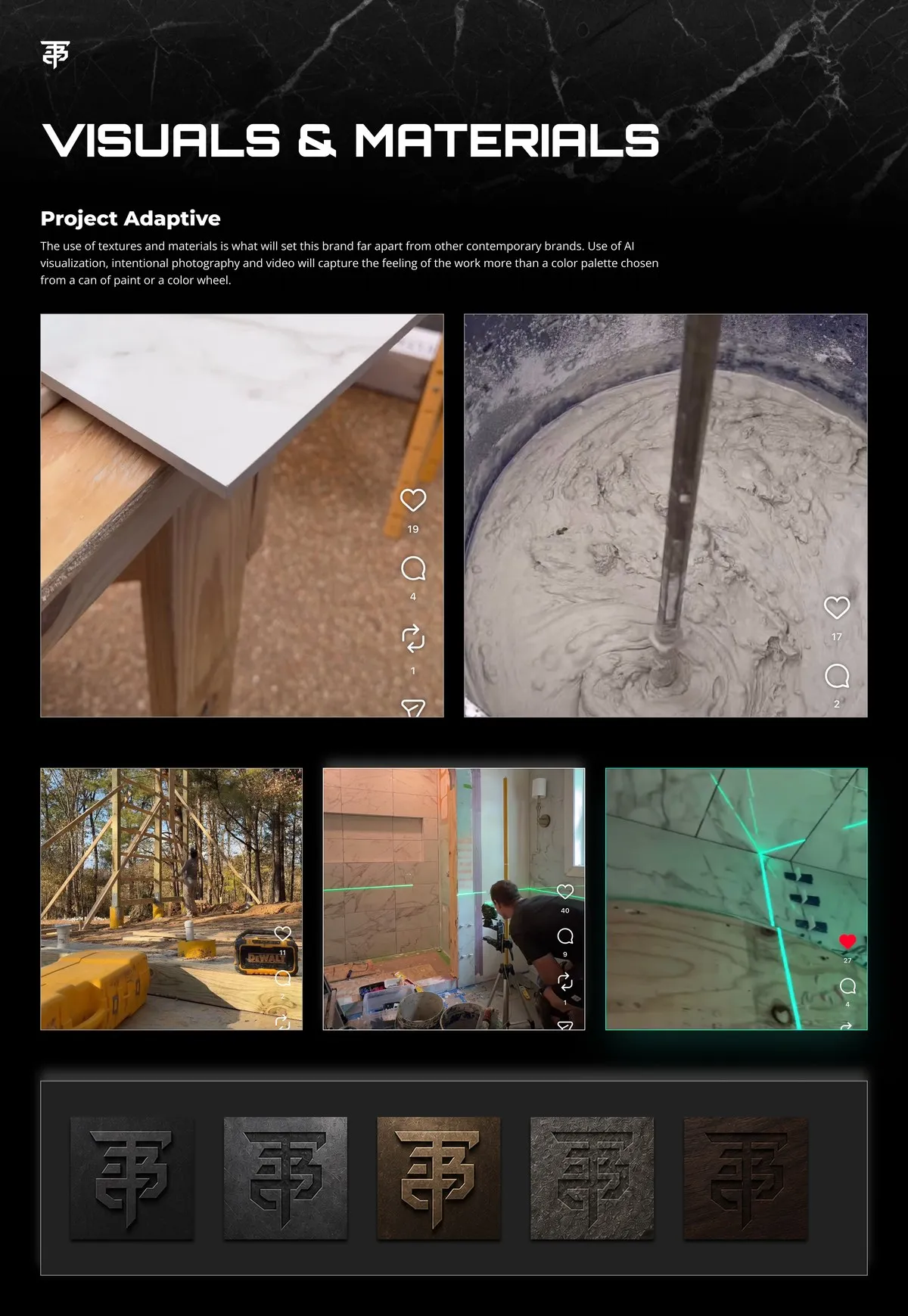
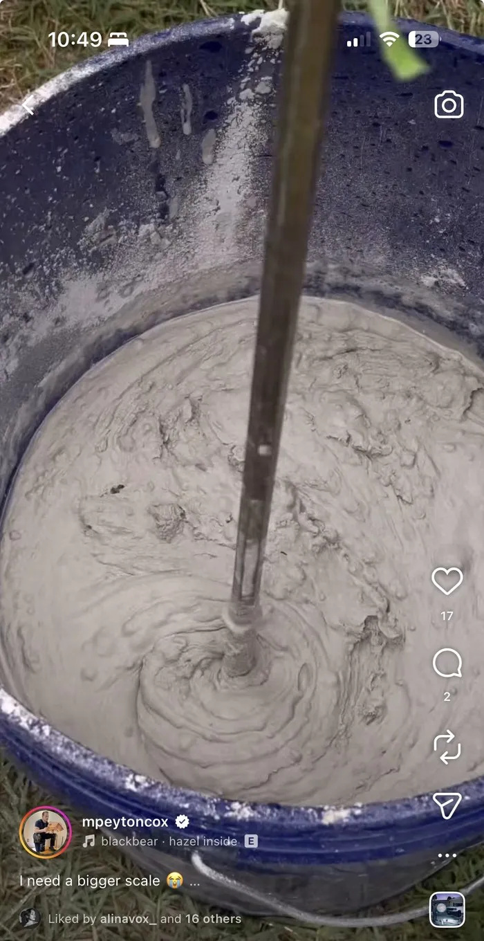
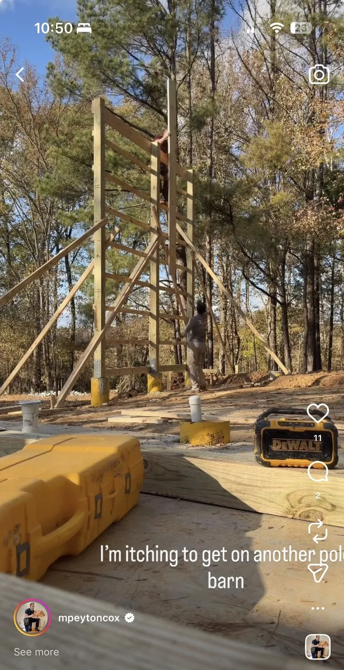
The photography direction was written against the content the crew was already making, rather than against a studio standard their team couldn’t afford to meet.
Results
One monogram, four sanctioned lockups, and a complete design system in Claude Design.
This delivery has ensured the client can generate on brand business cards, signage, and other marketing materials consistently, without needing to rely on the original design team for every iteration. All with ease and precision.
The numbers
- adaptive ai design system
- 1
- polished luxury logo
- 1 monogram
- art direction needed afterThe rules travel with the crew, not with me.
- 0
Disciplines and tools on this project
- Brand Identity
- Design Systems
- Art Direction
- Figma
- Illustrator
- Photoshop
- Claude Design